
Modulation Transfer Function (MTF) – A chart that displays the potential optical performance and characteristics of a lens across its aperture range.
Most of you will have come across MTF charts when visiting lens manufacturer’s websites, or reading a lens review. At first glance, they appear to be quite complex, but once you know the meaning of the various elements, they’re actually an easy way to gauge and compare the potential performance of specific lenses. I promise they are not as complex as they first appear!
Understanding MTF Charts
X-Axis
To understand what an MTF chart represents in terms of lens quality, first we need to know a little more about the chart itself, and what the axis mean. The x-axis (horizontal), represents the distance from the centre to the corner of an image. The horizontal axis for all full frame lenses will be the same, since all manufacturers use 24mm x 36mm sensors. APS-C sensors vary though, with Nikon using 1.5x cropped sensors, whilst Canon uses 1.6x. The diagram below represents a full frame sensor and using Pythagorus’ theorem, c=√(a2+b2), we know that the distance from the centre of the sensor to the corner is 21.6mm. MTF charts for full frame lenses therefore feature the markings 0, 5, 10, 15 and 20, with data continuing just a little past the 20 mark (to 21.6).

Full frame sensr size
Some manufacturers make lenses that are only useable on APS-C size sensors, like Canon EF-S lenses for example. MTF charts for crop sensor lenses will have a different scale on the x-axis that varies depending on the manufacturer. Canon’s current 1.6x crop APS-C sensor produces a measurement of 13.5mm from a sensor size of 22.4mm x 15mm, whilst Nikon’s (and other manufacturer’s) 1.5x crop sensor gives us a measurement of 14.2mm from a sensor size of 23.7mm x 15.6mm. You can quickly tell an APS-C MTF chart apart by the numbers on the scale of the x-axis. Nikon ones will have 0, 3, 6, 9 and 12, whilst Canon will have 0, 5, 10 and 13.

1.6x and 1.5x crop sensor size
Note: Canon has also produced APS-C sensors with a sizing of 22.5×15.0 and 22.2×14.8. This would produce a very slightly different looking MTF chart as the size of the x-axis would be different by a few tenths of a millimetre but the whole numbers on the x-axis remain the same: 0, 5, 10 and 13. I’m only mentioning it because it’s a point that confused the heck out of me whilst I was researching this article, and kept reading different diagonal sensor lengths quoted for Canon sensors. 🙂
Using full frame lenses on an APS-C camera?
If you plan on shooting with an APS-C camera for the foreseeable future, there’s a good chance that you won’t just be looking at lenses that only work on crop cameras. You can still use an MTF chart for a full frame lens to make a comparison to an APS-C only lens. All you have to remember is that on the x-axis, there is no point looking beyond the measurements at 13.5mm for Canon, and 14.2mm for all other 1.5x cameras. Everything up to that point, is what you will be able to see through your camera. In fact this demonstrates one of the benefits of an APS-C camera, in that a lens loses resolution and sharpness towards the edges, but with a full frame lens on a crop sensor camera, your image won’t ever reach that far! That’s why vignetting, chromatic aberration and general sharpness appear better on the edges of an image shot with an APS-C camera.
Y-Axis
Resolution And Contrast
- Resolution – The ability to reproduce fine detail
- Contrast – The ability to distinguish between dark and light subject levels
Before we dig deeper into the meaning of the y-axis, we need some fundamental understanding about contrast, resolution and how this affects our images. We tend to think in very simple terms about lenses: are they sharp or not? The reality is that our perception of sharpness is affected by both contrast and resolution, and a good lens needs to have both in order for it to appear sharp.
A lens with low contrast and high resolution is no good, and neither is a high contrast lens with low resolution. It’s important for manufacturers to strike a balance between these two criteria. There lies one of the biggest challenges in optical design because at the high end of performance, a change that leads to an increase in one of them can often lead to a decrease in the other!
Take this photo of my dog below as an example. For the purposes of demonstration, I’ve lowered the contrast of the image manually in Photoshop. The image doesn’t appear to be that sharp, but it was actually shot with a Canon 300mm f/2.8 L IS II, Canon’s sharpest lens ever! The fine details remain in the image because this is a lens that delivers incredible resolution, but when the contrast is lowered, it amounts to very little. We need both contrast AND resolution to achieve “sharpness”.
What is great about MTF charts is that they show us both of these things!


Low contrast


As-shot contrast
I’ve often had people look at my iPhone photos on social media channels and say “wow, that’s sharp!” when the photos have been edited to give more ‘pop’ and contrast. You may well have experienced the same thing and as a photographer, I think to myself… no it isn’t! I know that an iPhone photo isn’t even close to being as sharp as an image from my DSLR, but contrast can do wonders for what we call, perceived sharpness. You could make an excellent argument that a lens with high contrast is better than a lens with high resolution. I certainly notice it more when I get a lens which delivers exceptional contrast. When it comes to professional lenses, I have to really pixel peep to see the difference in resolution these days, but increased contrast jumps right out at me from the screen.
Measuring Contrast & Resolution
An MTF chart is essentially a graphical representation of a lens’ contrast and resolution across the whole image, and sometimes the chart will also show these results for two different apertures. But now that we know that both of these things are important, how are they measured?
Optical software or physical test benches measure a lens’ ability to reproduce an image that contains a set of repeating black and white lines, called line pairs. Line pair patterns are defined by their spacing, how many lines there are in one millimetre. Generally, lens manufacturers test with patterns of 10 lines/mm and 30 lines/mm. Sometimes you might see these written as 10 lpm and 30 lpm.
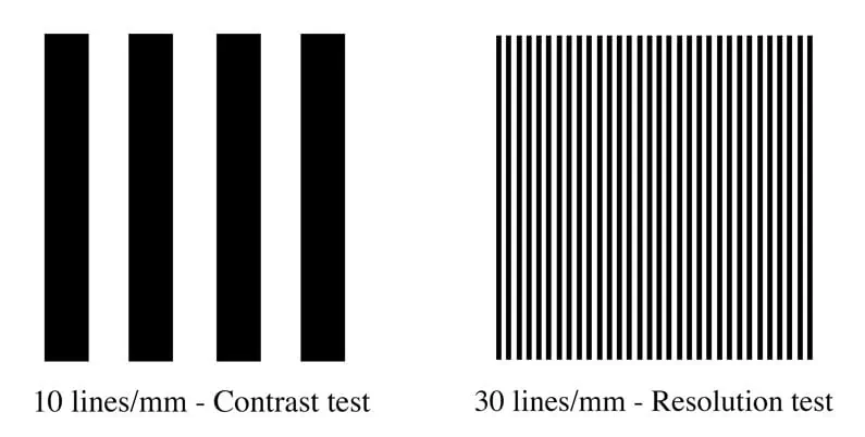
(representations only, spacing not accurate)
The lower 10 lines/mm pattern tests for contrast, since the lines are spaced far enough apart that any half-decent lens will resolve them with no trouble, their accuracy of reproduction simply comes down to the lens’ ability to display contrast. The higher 30 lines/mm pattern is a good test for resolution. Imagine 30 lines in the space of 1 millimetre! That’s some fine detail!
Since we know what the test pattern should look like, the image that is captured in testing is compared to this perfect representation of the lines. The MTF score is a percentage score of how well the lens was able to reproduce the test pattern. A score of 100 would be a perfect score, and this score is what gives us the values to plot the curves on an MTF chart. The reproduction tests are carried out with both sets of line pairs, placed at different distances from the centre of the lens. Not that complicated now you know, right?
The vertical axis of an MTF chart is usually annotated with decimals from 0 to 1, but actually these numbers are representative of percentages from 0% to 100%. The closer the data point gets to 1, the closer it is to perfect resolution and contrast. A perfect MTF chart would have perfect contrast and resolution right from the centre of the image, to the corner.

A theoretical perfect MTF chart

A more typical MTF chart
Sagittal And Meridional Testing
Now we know what we are testing, how it is tested and how it’s plotted on an MTF chart. There’s one more piece to this puzzle though because lenses actually reproduce fine detail and contrast in different amounts, depending on the orientation of the test patterns (or any other subject for that matter). This presents us with a problem: Do we just use one standardized orientation of the lines, do we test a variety of orientations and show an average result, or do we display results from multiple orientations on the graph so you can actually see by how much the contrast and resolution changes?
The answer is, for all major lens manufacturers, the latter option. Test patterns are oriented in two different ways that are perpendicular to each other and results are recorded and plotted for both these reproductions. The two orientations are called Sagittal and Meridional, and this means that an MTF chart from a lens manufacturer will have a minimum of four lines on it:
- 10 lines/mm Sagittal
- 10 lines/mm Meridional
- 30 lines/mm Sagittal
- 30 lines/mm Meridional
The sagittal results will always be higher than the meridional ones and it should be noted that the orientations are very specific. Sagittal means that the test pattern lines run parallel to a line running from the centre of the image to the corner, and meridional lines are perpendicular to that diagonal. This produces results for both the best-case scenario, and the worst-case scenario, so it gives us the most accurate overview of any variation.

Contrast and resolution is now tested in both pattern orientations across the width of the image. As the sagittal and meridional lines on an MTF chart start to diverge, called astigmatism, it’s effectively telling us that the amount of image deterioration occurring as we approach the edge of the lens, is not the same in all directions. Think about it like this: If your image is going to be a little bit blurry, you would at least hope that the blur occurs in equal amounts in all directions, right? Otherwise it’s going to cause a slight distortion effect on your subject. That is astigmatism, and it’s not good! In fact it’s said that astigmatism is one ingredient in the magical recipe for ‘good’ bokeh.
Being able to see how quickly the sagittal and meridional lines diverge across an image, can start to give us our first clues about distortion. Sometimes astigmatism can be caused by lateral chromatic aberration as well (LCA). We normally think of chromatic aberrations as being something we can reduce by using a smaller aperture, but lateral aberrations are actually independent of aperture and can cause red/cyan colour fringing that has to be removed in post production. If these coloured fringes appear in the test charts then this causes a lower MTF score because, of course, the colours are not present in original test pattern. Strong astigmatism is a sure sign of lateral chromatic aberration in a lens.
MTF Test Procedure Summary
And that’s it! With the combination of contrast and resolution tests, with both sagittal and meridional line orientation, we can get an excellent idea as to how a lens will perform in terms of our perceived sharpness. Different manufacturers do things slightly differently in terms of how they show their charts, so the next section will walk through this for the most popular brands.
This diagram sums up the testing procedure quite nicely, showing which tests are performed, and where.

What Do The Lines On An MTF Chart Mean?
Before I knew any better, I assumed that the lines on an MTF chart were a lens’ performance at a variety of apertures. From asking a few other photographers before writing this piece, this seems to be a pretty common misconception, or should I say… part misconception. In fact the lines only represent two different aperture values, and that’s only if we are talking Canon’s charts! Canon chooses to display test results for a lens at two different apertures, whereas Nikon and some other manufacturers show only the wide-open performance.
How To Read Canon MTF Charts
Black lines represent results for a lens at its widest possible aperture, and blue lines represent results at f/8. Why f/8, you might ask? Well this is typically though of as being the “sweet spot” of a lens, in terms of image sharpness. Smaller apertures begin to suffer from diffraction, and whilst a lens’ sweet spot might vary somewhat based on the value of its maximum aperture, it’s a pretty safe bet to say that f/8 is going to be just about the sharpest value.
As you can see though, there’s more to it than simply black and blue. There are four line variations within each colour: thick and thin, solid and dotted.
Solid lines represent results from meridional tests, while the dotted lines show sagittal results, as discussed earlier on in the article.

- Black lines – Results at widest possible aperture
- Blue lines – Results at f/8 (“sweet spot”)
- Solid lines -Meridional results
- Dotted lines – Sagittal results
- Thick lines – 10 lines/mm
- Thin lines – 30 lines/mm
(Note: If you just skipped right down to this part, you’ll probably want to back up a bit and read about the Meridional and Sagittal tests with the thicker and thinner line sets. Sorry to be a bore, but it’s important!)
How To Read Nikon MTF Charts

Nikon MTF charts only show results for the lens with a wide open aperture. Handily, they tend to be published with a key, so you don’t need to remember exactly what each line represents. Personally, I find the lack of a second set of results for a second aperture to be a loss. One of the great indicators of a lens’ quality is how well the lens performs wide open, compared to its full potential when in the sweet spot. Whilst it’s better to have wide open results than just results from the sweet spot, I do wish Nikon would provide both like everyone else.
- Red lines – 10 lines/mm
- Blue lines – 30 lines/mm
- Solid line – Sagittal results
- Dotted line – Meridional results
How To Read Sony And Zeiss MTF Charts
Whilst many of the MTF charts from Sony and Zeiss seem to be harder to track down, they actually provide us with even more information than the Canon charts do. What’s more, in the case of the Zeiss lenses at least, the charts are said to be generated from tests of real sample lenses, unlike Canon’s theoretical values. For those that are interested, Zeiss has a complex white paper on MTF charts here.

Sony MTF Chart
For these charts, we actually have results for three different line thicknesses, as well as meridional and sagittal results at two different apertures. This yields a total of 12 different lines so they are split onto two charts to avoid confusion. It should be noted that while Sony shows results at maximum aperture and f/8, just as Canon does, Zeiss’ second stopped down aperture actually varies depending on the lens. It’s not always f/8!
Note that here in this chart, Sony is referring to sagittal as radial, and meridional as tangential! While below, Zeiss chooses to use the sagittal and tangential terminology. Just to try and confuse you!

Zeiss MTF Chart
As we can see in this Zeiss MTF sample, the secondary aperture is chosen to be f/5.6. Zeiss MTF charts also tend to be in black and white, so you really have to know that they plot results for three different line thicknesses, just as Sony does: 10, 20 and 40 lp/mm. Since the thinest line results (40 lm/mm) will always be on the bottom, you don’t really need different colours.
Other Manufacturers

Tamron MTF chart for a zoom lens, showing max aperture results at both ends of the zoom spectrum
The fact is that most people reading this will shoot Canon, Nikon or Sony, and every manufacturer has a slightly different way of doing things. I’d love to provide information on every manufacturer’s methods, but at the moment it’s not practical. Having said that, there’s more than enough information in the three types I have explained, to be able to decipher any other manufacturer MTF charts. Tamron, Fuji, Panasonic and Olympus all have similar methods that use either identical charts to one of the big three, or use a combination of them that is easy enough to understand with the information that’s provided here.
Different brands, different charts…
Unfortunately, it’s not possible for us to use MTF charts to compare lenses from different brands. Whilst the testing procedures within a specific brand are closely controlled, there is no industrywide standardization. Is the Nikon 70-200 f/2.8 sharper than the Canon 70-200 f/2.8? That’s something we just can’t tell from MTF results since Canon base their charts on theoretical values for a lens, whilst Nikon base theirs on actual measurements from a set of lenses. Given the expensive nature of accurate optical test benches, it’s also not information that is always available online.
MTF Chart Limitations & A Conclusion
MTF charts can, at a quick glance, give us a first impression of the sharpness of a lens. What they can’t do though, is give us an impression of what you might loosely call ‘quality’. The quality of a lens doesn’t have a specific definition, or unit of measurement. It’s made up of much more than just sharpness! Vignetting, susceptibility to flare, chromatic aberrations and distortion, all contribute to the overall quality of a lens. Whether a lens is right for you shouldn’t just be about the results you can see on an MTF chart. It’s important to take into account the other factors as well, and generally these will have to be discovered by either reading the reviews of trusted websites and magazines or by renting a lens and trying it for yourself. Whilst it’s true that things like distortion, aberrations and vignetting can be quickly fixed in programs like Adobe Lightroom, there is a slight loss of quality when this happens. To most, it’s imperceptible, but if you are putting together a camera kit with the utmost image quality in mind, then it can become a factor. I used to own the Canon 85mm f/1.8 for example, but it exhibited an unacceptable amount of chromatic aberration, for me at least, despite being razor sharp on the MTF charts. It bugged me enough that I sold the lens.
Your own photographic subject matter should also factor into your decision. For example, astrophotographers would want to pay close attention to vignetting performance, since brightening dark skies in the corners of high ISO images can contribute considerable noise to the final image. Again, something you simply could not know from an MTF chart alone.
These charts are an excellent starting point to your lens research, and very often a lens with a high MTF performance does perform well in other areas, but it should not be assumed.
A quick request
Long form content like this is incredibly time consuming to create. This piece alone took me approximately 30 hours of research, writing, re-writing and designing. I want to continue to deliver this kind of quality to you guys for free, but you can really help me out by using the links on this site when you make your photography gear purchases. The small commission we sometimes make on those purchases goes a really long way. For a list of links, you can visit the support page.
Pin This Post


This is the best explanation of how to interpret MTF charts I have seen so far. Been thinking of writing one myself but doesn’t feel the need after seeing this! Great work!
Thanks Michael!
Hi Dan – thanks a million, for this article – it’s sensational. I particularly love your explanation of sharpness, and how we can get it, and why some methods are better than others. I belong to a photography group in France (DearSusan), and I hope you don’t mind me passing it on.
When I reach the “theoretical perfect MTF chart” my instant reaction to the diagram was “what in hell is THAT?” – in all the years (decades!) that I’ve been reading articles like this, I’ve NEVER seen a graph like that, before! Then I read the caption, and collapsed laughing! 🙂
Glad you found it useful! Feel free to share 🙂
shouldn’t the x-axis be the spatial frequency??
What does the a and b represent. Distances on X and y axis. It would help to put in actual numbers and then give the value of “c” to show how it is explicity calculated for 5 on x 10 etc..
Good morning –
I would like to know whether you have covered MTF performance for the better lenses for the Blackmagic URSA Cine 17K camera (17520 x 8040 RGBWW sensor as opposed to R or G or B Bayer sensors), such as the ones listed in the FILM AND DIGITAL TIMES September 2024 issue.
Now that Sigma abandoned Foveon-type sensors for the time being, I imagine Blackmagic might make your site quintessential as MTF curves are harder to find lately…
Sincerely,
Christopher Quarksnow
Sorry, this isn’t a topic I have covered.